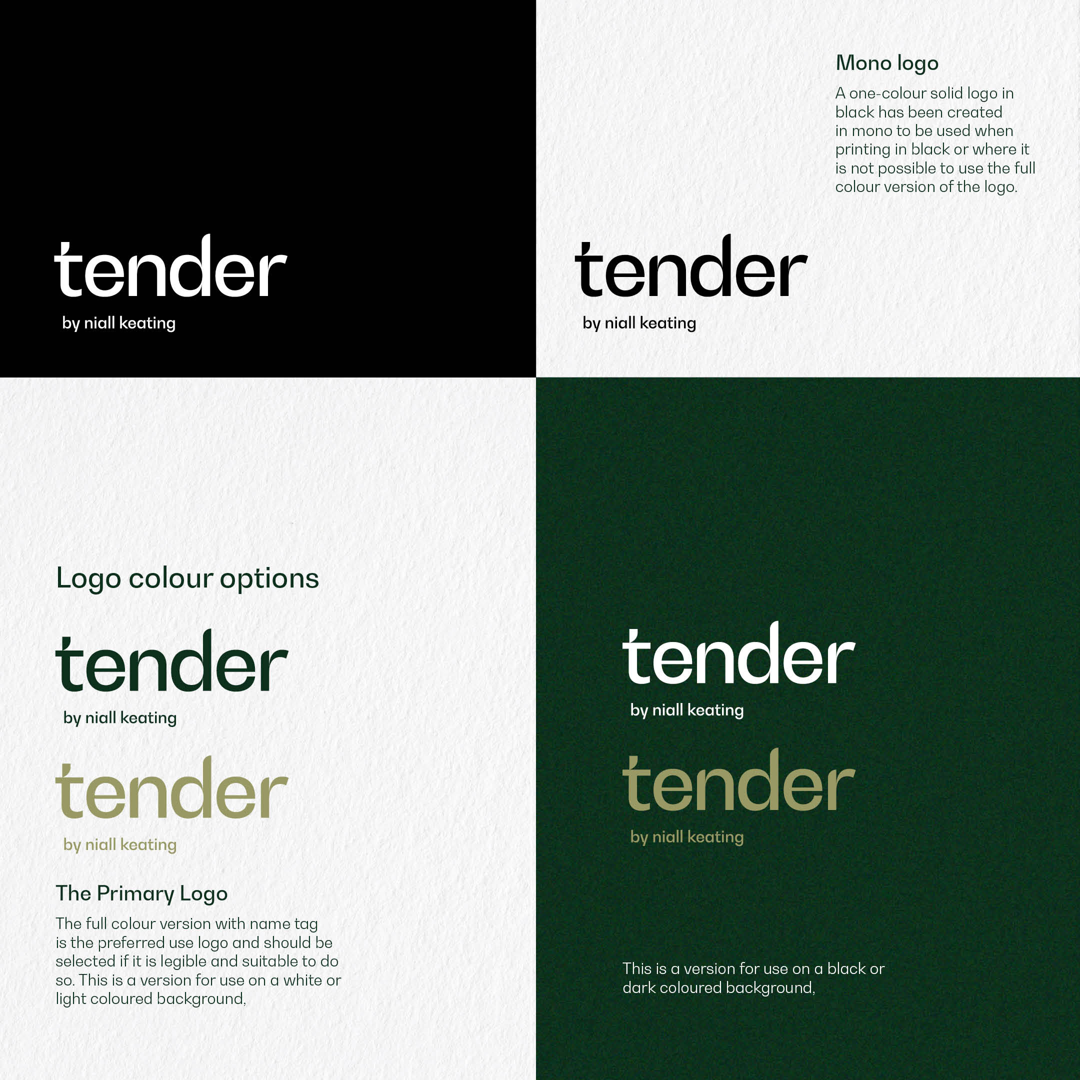
When Michelin-starred Chef Niall Keating approached us to help launch Tender, his new high-end brasserie within Manchester’s historic Stock Exchange Hotel, we were tasked with more than just creating a logo or menus. The challenge was to build an entire brand identity that would encapsulate the heart of Niall’s culinary vision—a warm, inviting, and inclusive dining experience that speaks to the senses while honoring the legacy of the building.
Niall’s team wanted a brand that was not only sophisticated but also approachable. It had to bridge the gap between fine dining and comfort, appealing to diverse audiences from business professionals and hotel guests to local families. The identity also had to reflect the deep connection between the restaurant and the building’s historic roots.
Our Approach
At Sicocreative, we began by immersing ourselves in the Tender concept and the ethos behind Niall’s culinary philosophy. Our goal was to create a brand that reflects the essence of Tender—one that activates all the senses and feels both luxurious and welcoming. We collaborated closely with Niall and his team to distill the key elements of the brand: indulgence, comfort, and quality.
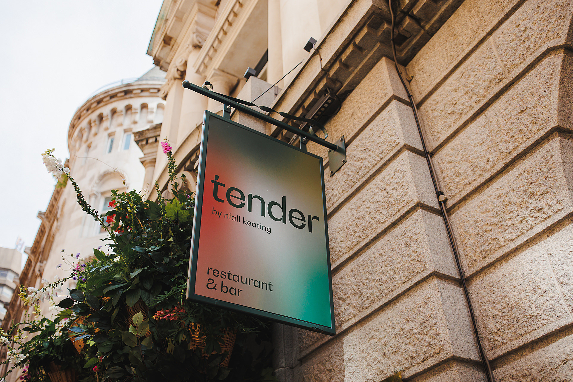
The design process started with a thorough understanding of Tender’s audience and space. We developed a brand identity that played on the dual meaning of “Tender”—the legal tender connection to the Stock Exchange and the tender, personal experiences of taste and touch. This conceptual approach allowed us to build a strong visual narrative using sensory-driven motifs like the gradient lozenges representing the five senses and textures that evoke warmth and sophistication.
The Solution
Sicocreative developed a comprehensive brand identity that seamlessly weaves together the restaurant’s sensory experience with the historical significance of the Stock Exchange Hotel. Our solution included:
- Brand Vision & Identity: We established a clear brand vision rooted in sensory engagement, carefully crafting every element to complement the indulgent experience Tender offers. We combined sophisticated typography with tactile, high-quality materials to convey luxury while maintaining an approachable feel.
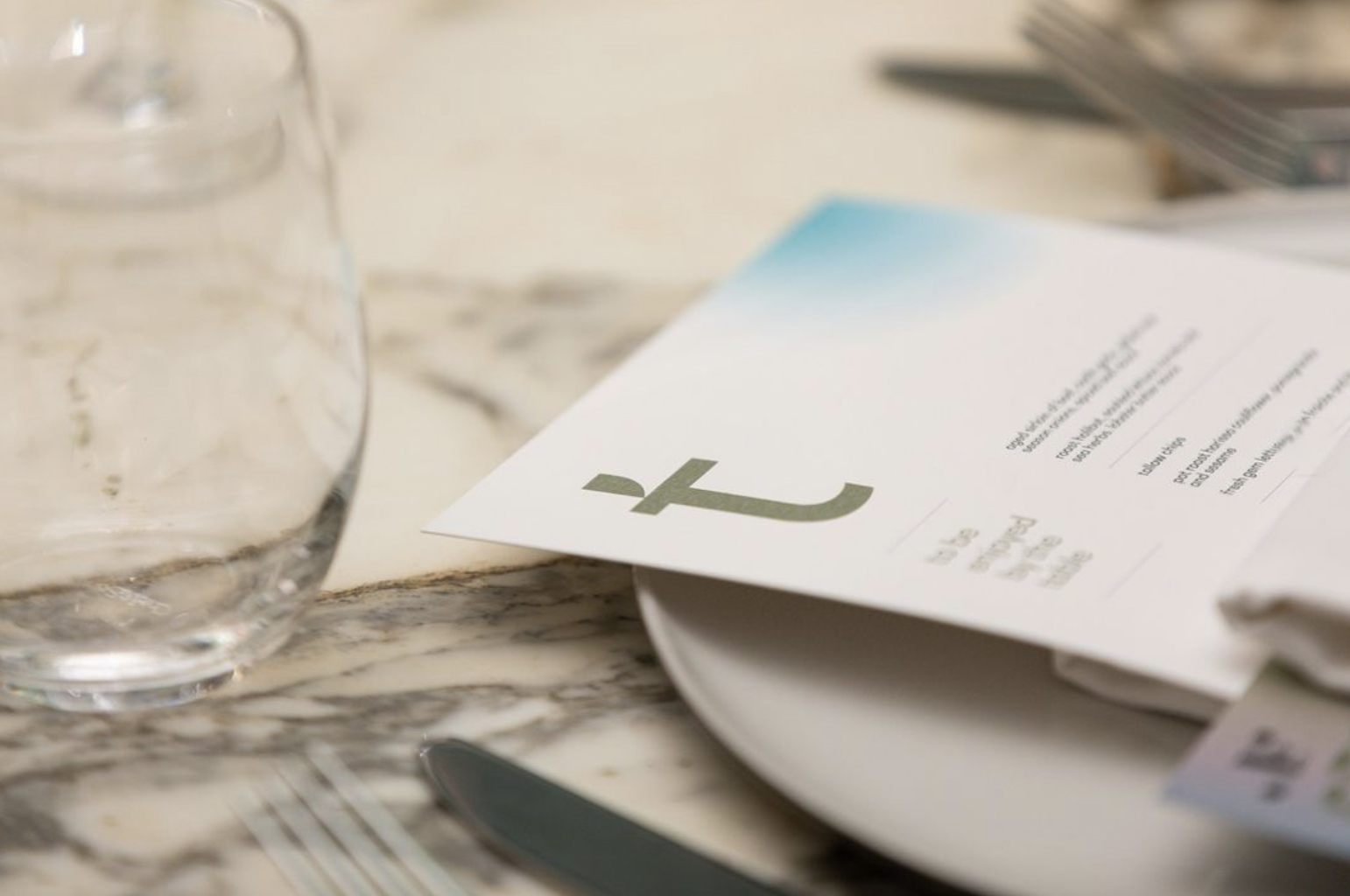
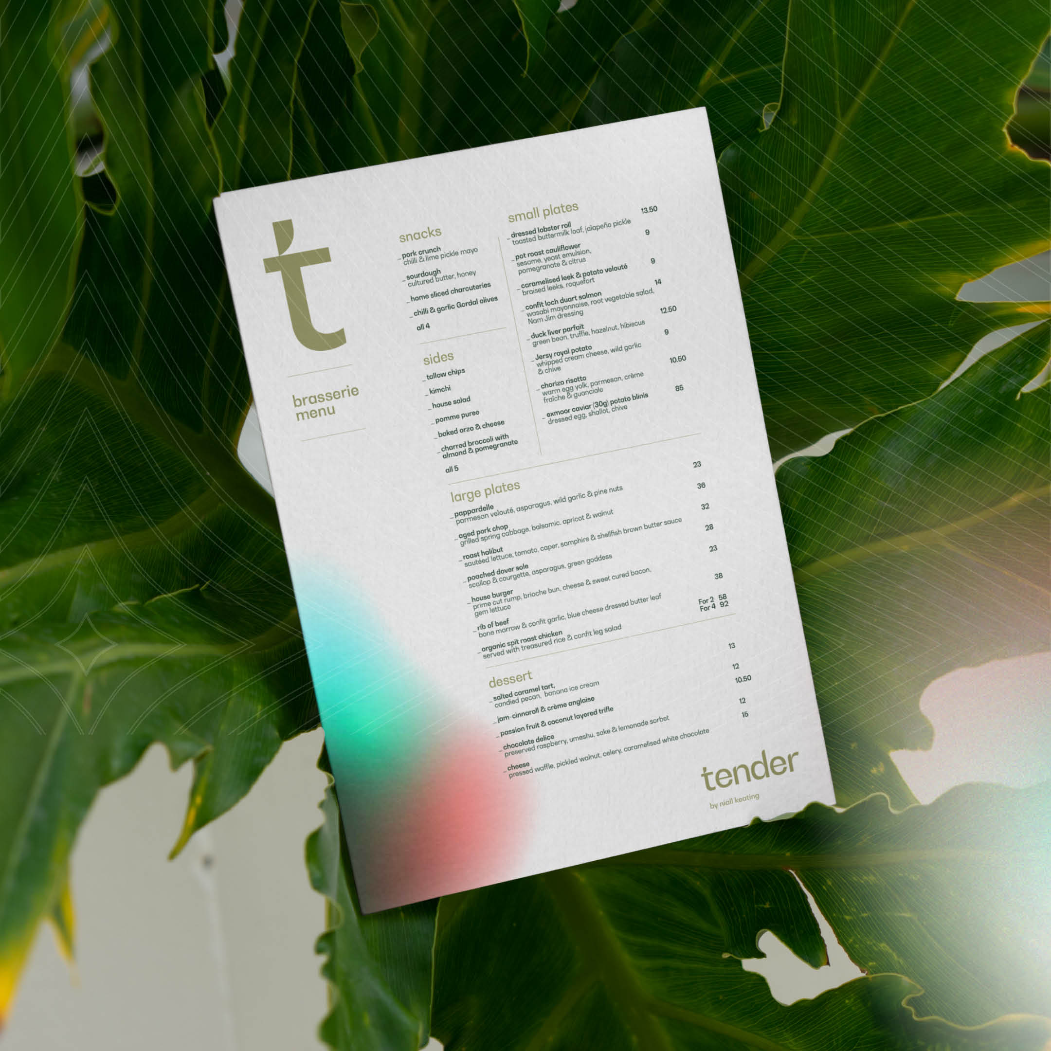
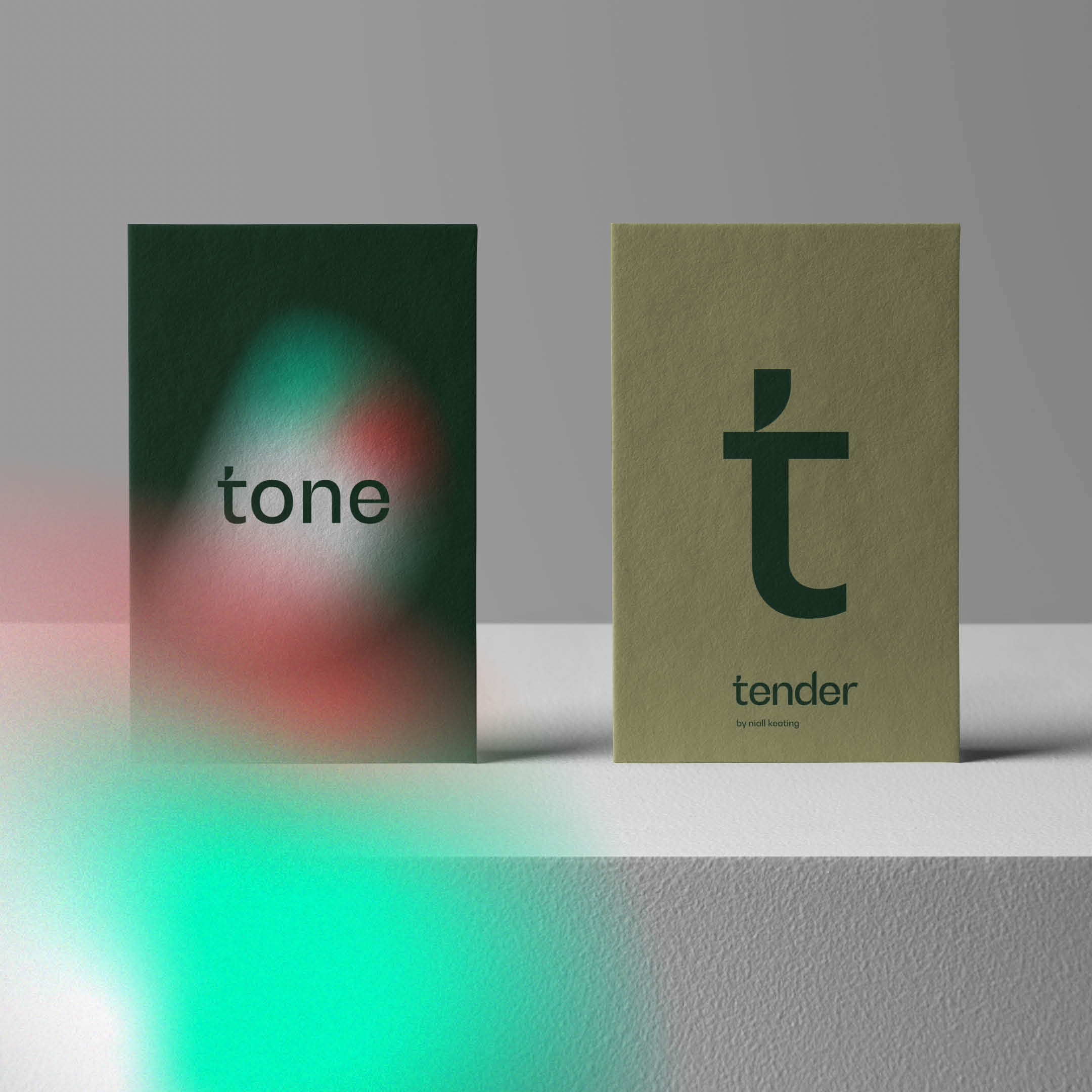
- Visual Elements: We created custom-designed lozenges and gradients to visually represent the five senses, adding depth and movement to the brand story. Textured papers and pearlescent finishes for menus and collateral reinforced the tactile aspect of the dining experience, reflecting the restaurant’s attention to every detail.
- Tone of Voice: We developed a welcoming yet refined tone of voice that reflects the restaurant’s high-end but inclusive nature, ensuring consistency across all communication touchpoints—from menus to marketing materials.
The Result
Through thoughtful collaboration and creative exploration, Sicocreative helped Tender launch with a brand identity that is not only visually stunning but also deeply connected to its core values. The brand now exudes warmth, sophistication, and sensory richness, creating a lasting impression that aligns with Niall’s culinary vision and the prestigious setting of the Stock Exchange Hotel. Tender’s brand identity invites guests to experience something truly memorable, ensuring it stands out in Manchester’s high-end dining scene.

